So, as you have already explored the way of creating custom registration and login pages, now it’s time to explore the opportunities. With the WholesaleX form builder, you get numerous customization options. Let’s explore opportunities separately to get a better understanding.
Field Customization
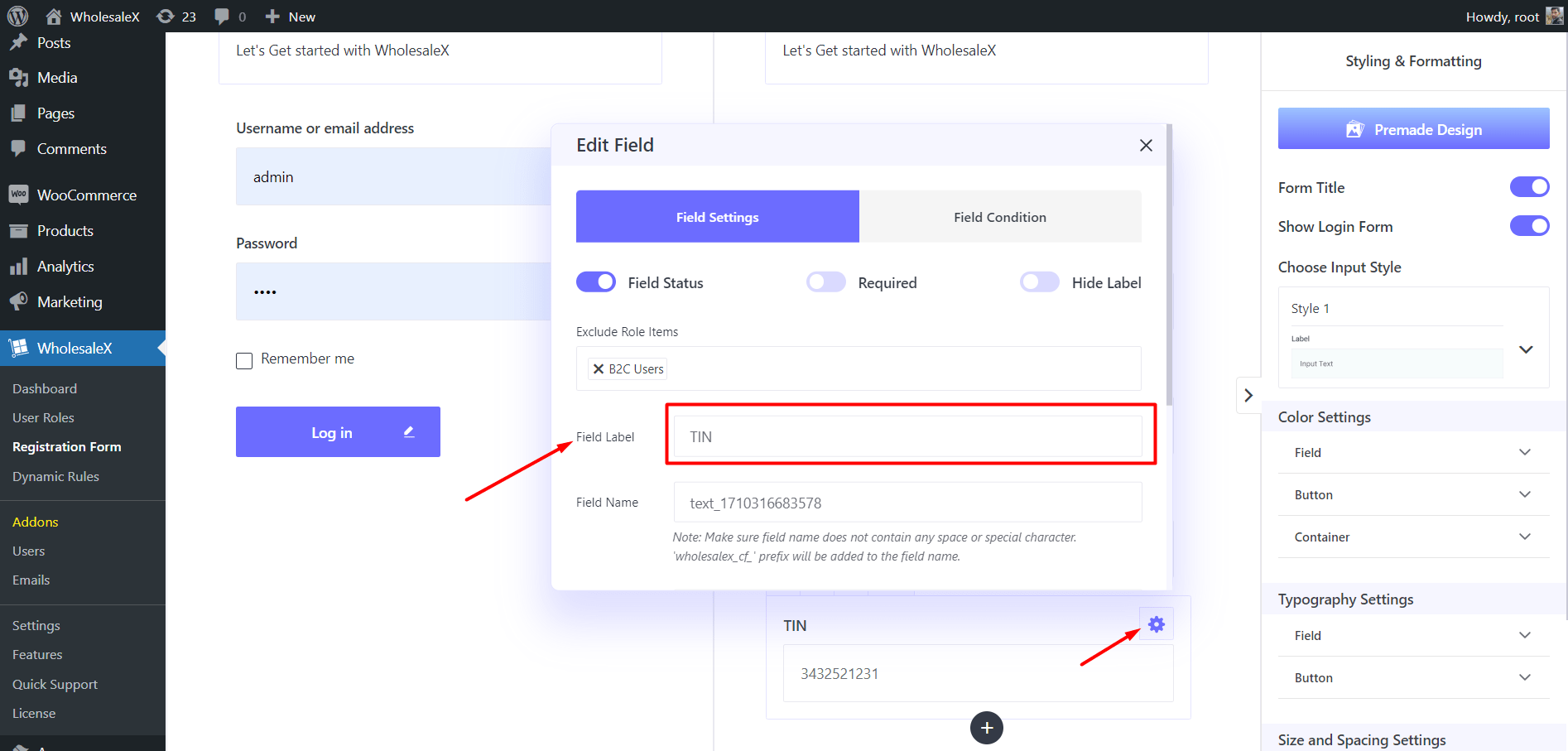
Let’s start the field customization options. Once you select any of the fields you will see a gear icon (settings). Clicking on the icon will open the available options.
Here you can see two tabs one is for the field settings another is for making this field conditional. For now, we explore only the field settings options.
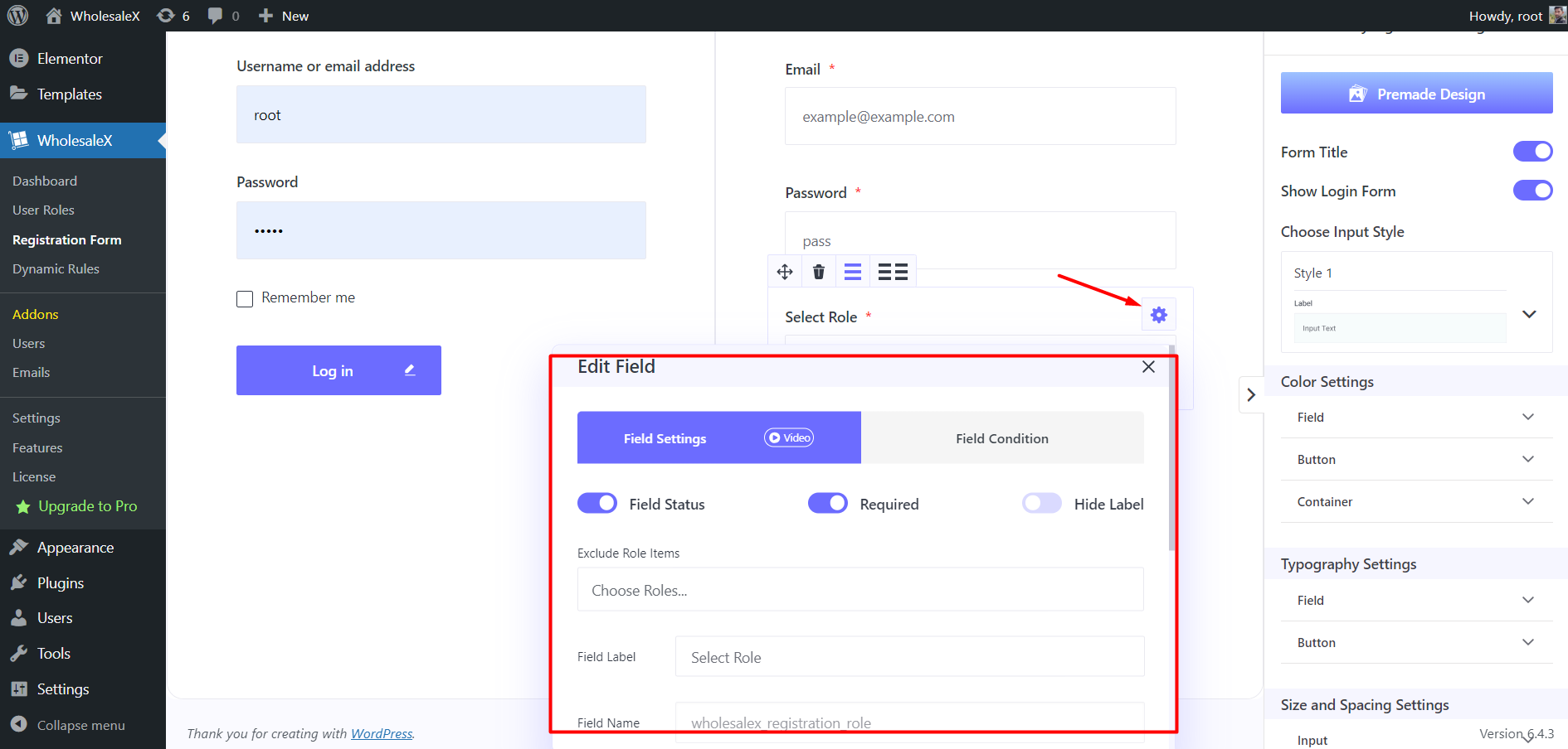
At the top position three enable or disable the following options:
Field Status: Disabling this option will hide this field from the users.
Required: Enable this option if you want to make this field mandatory.
Hide Level: Enabling this option will hide the level text.
Then we exclude this field from any of the user groups by selecting the user role from the dropdown. So, the users of the selected will not see the field.
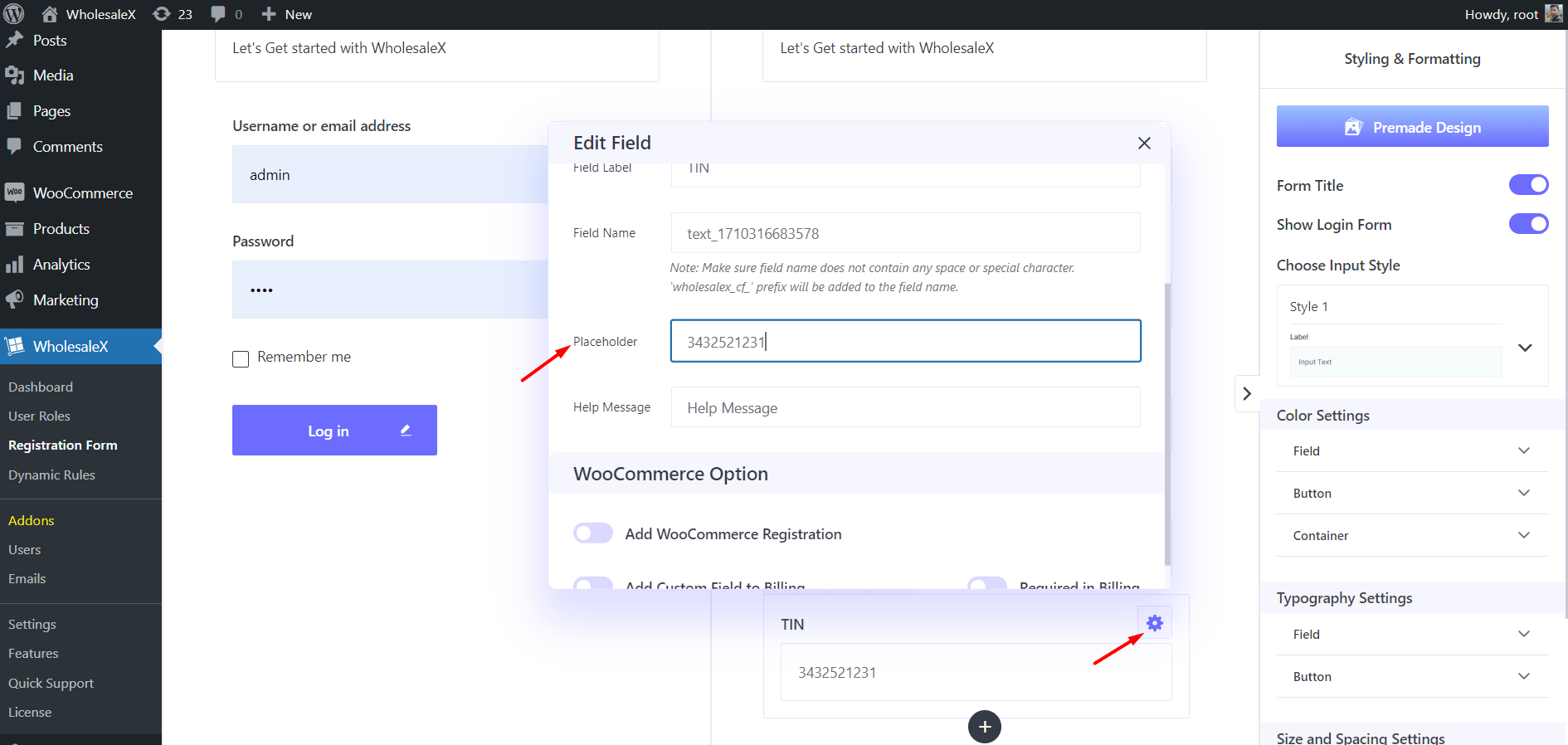
Moreover, we can add custom text Field Level, Placeholder, and Help Message. Field Level is the name of the field, Placeholder is an example of what the users need to type here.
And, the Help message is for adding any text to educate users of the requirements of the field. It is very effective in avoiding confusion about a field.
Custom Fields
If you want to add a custom field, click on the “+” icon. Here, you can see two options, Default and Extra fields.
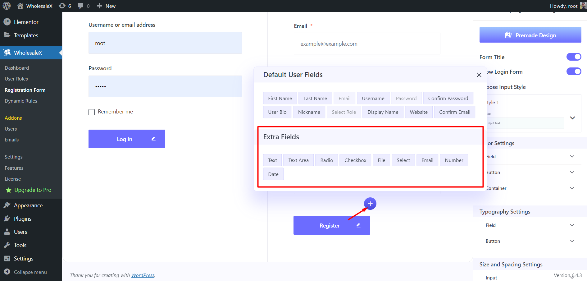
For adding a custom field, you need to look for an appropriate option on the extra field options. Here are the available custom field options:
- Text
- Text Area
- Radio
- Checkbox
- File
- Select
- Number
- Date
So, choose your desired field and adjust it as per requirements. For example, you want to add a field for the Tax Identification Number. For that, you can add the Text field to your registration form. Then you need to change the name field name and placeholder text as per your requirements.
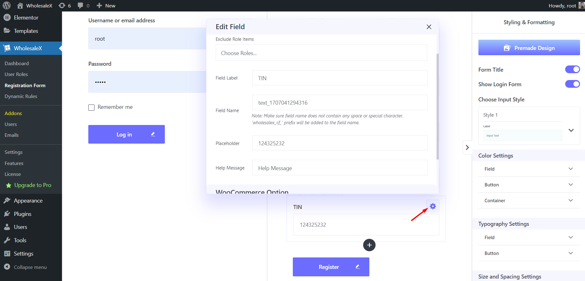
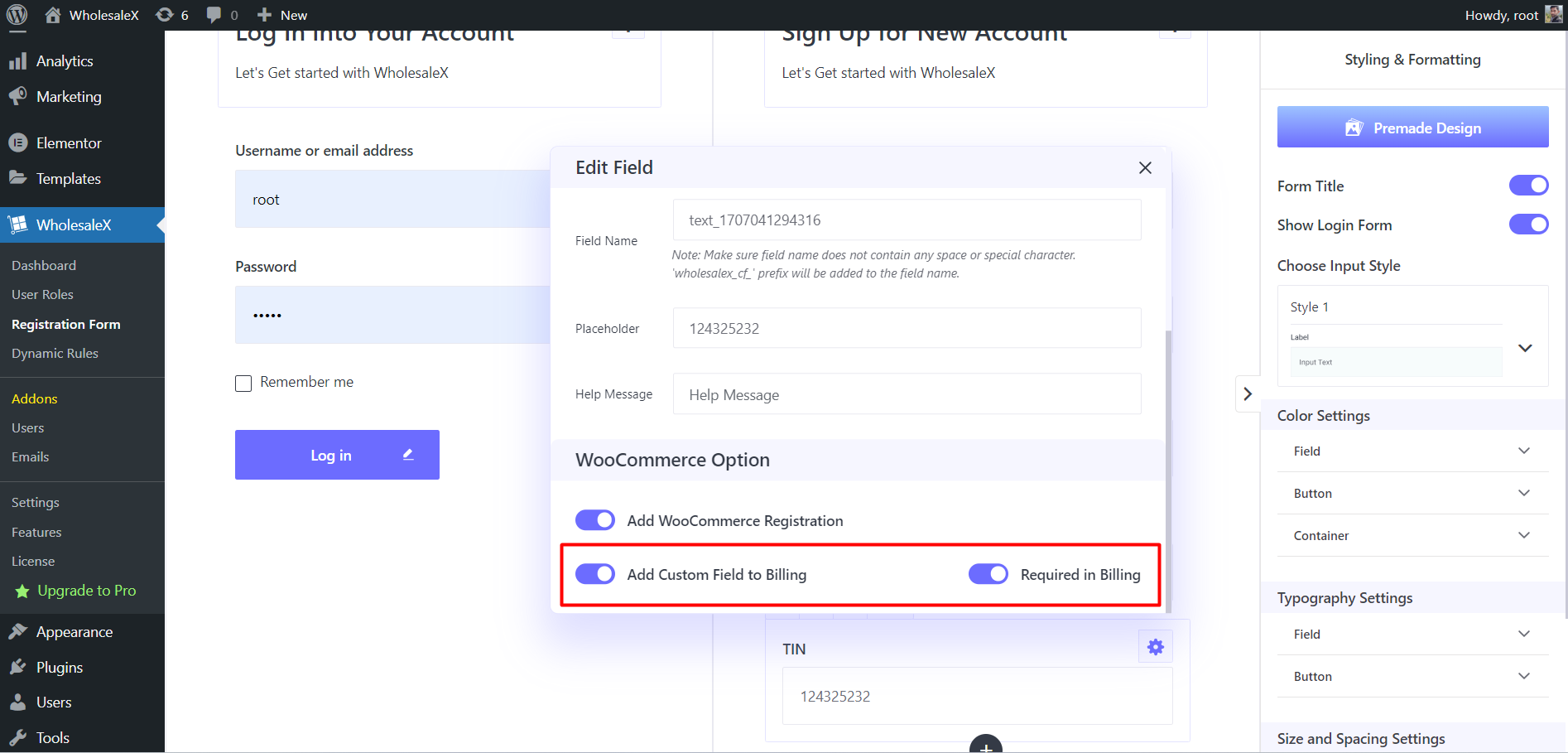
Similarly, you can add as many custom fields as you want. The custom fields have some additional settings. To explore them, click on the settings options of any custom field and scroll down to the WooCommerce option section.
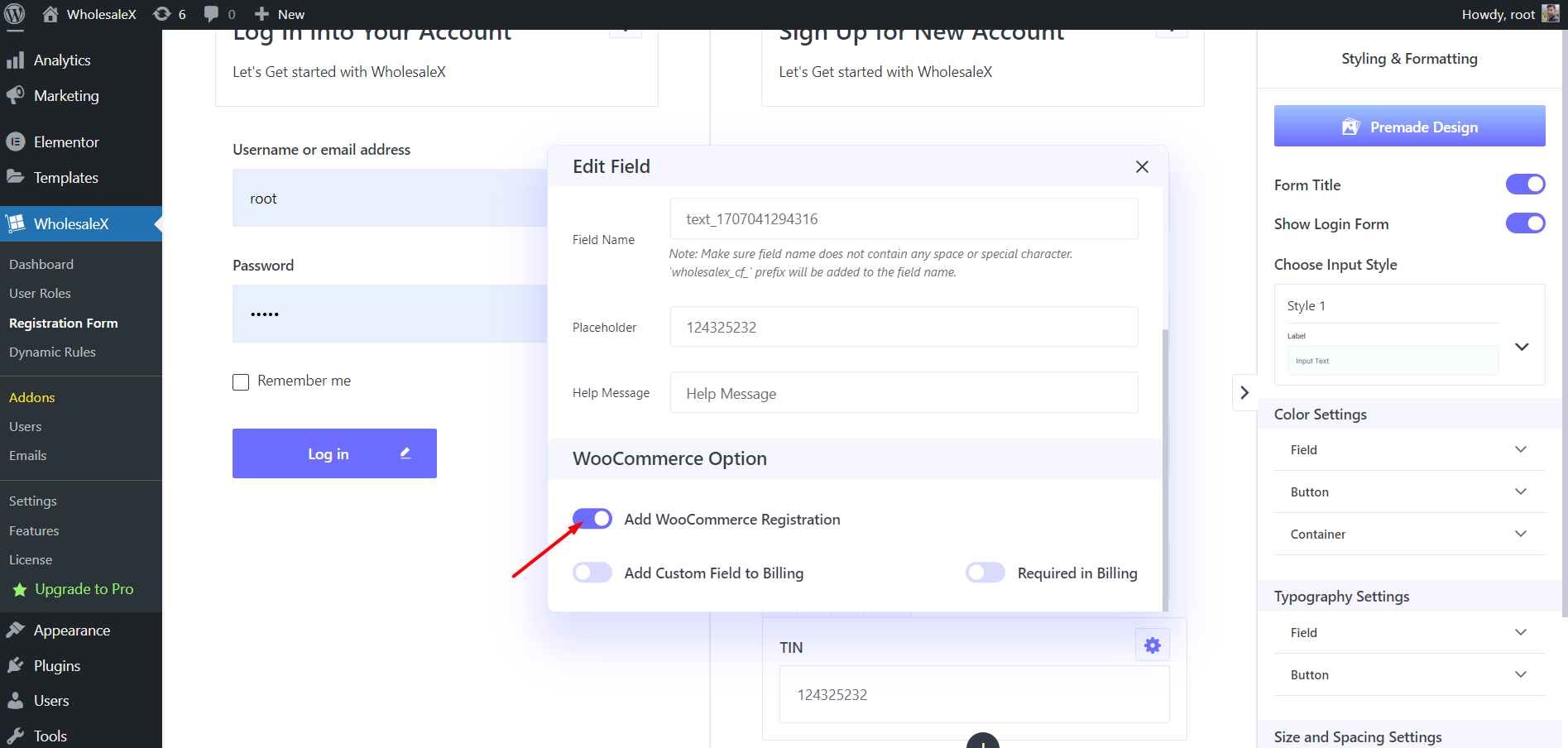
Here you can see three options. You can use these options to add this specific field to the Default WooCommerce Registration and Billing Form (at the Checkout Page). Moreover, you can also make this field mandatory in the billing form.
Conditional Field Setup
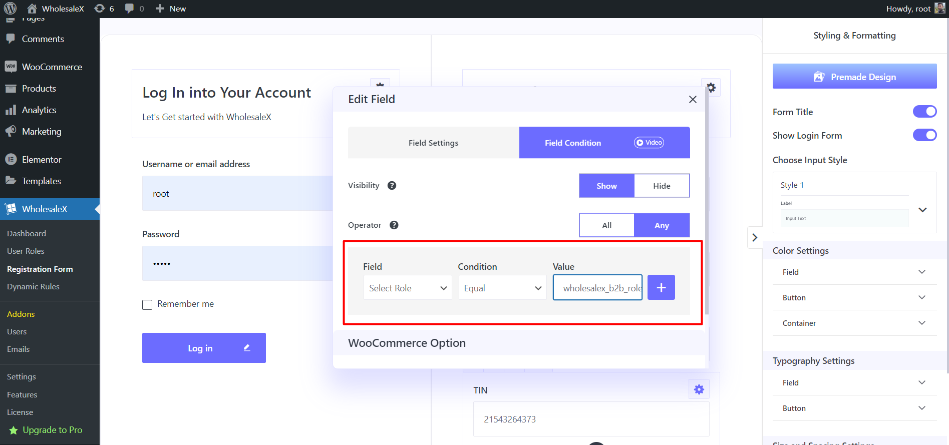
The custom fields also come with the option to set conditions based on other fields. So you can display hide and custom fields based on predefined conditions. For example, I want to display only the Tax Identification Number field if someone selects the B2B Gold user role.
In this situation, I need to open the setting section of the Tax Identification Number and add the required condition. From the settings section, we need to select the Condition Tab. Here we can see the condition setting options.
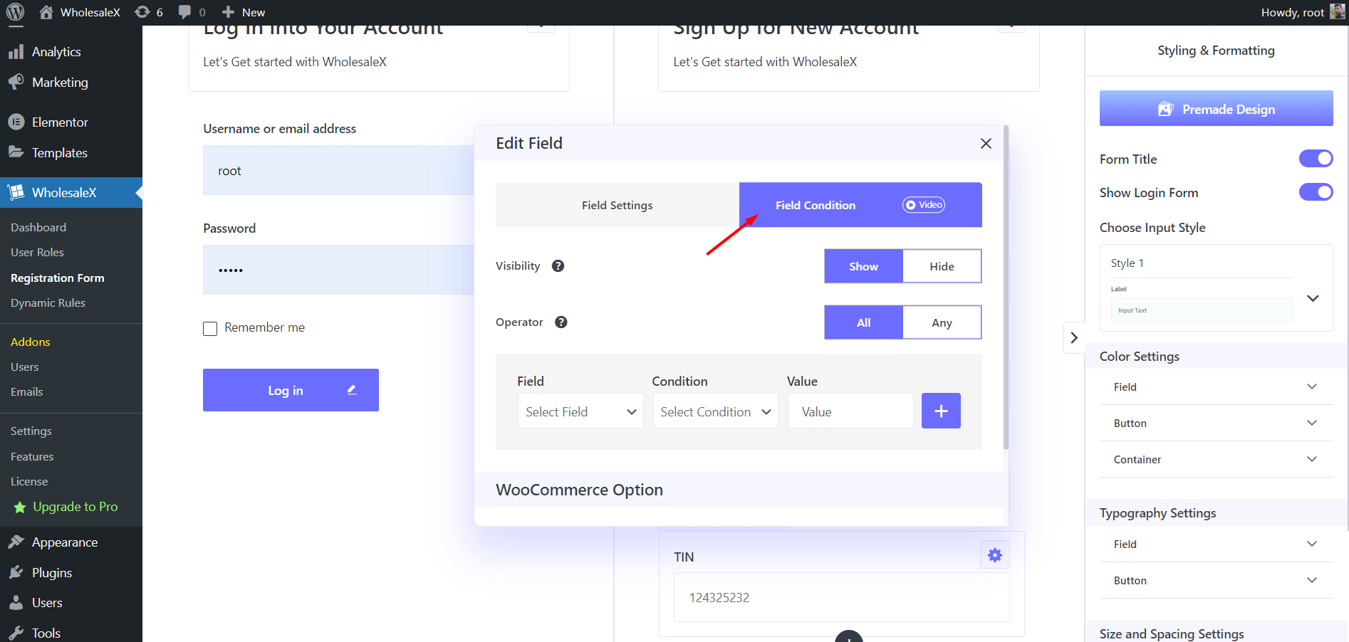
First of all, we need to decide and select whether we want to show or hide the field upon condition completion. Then we need to select the operator between all or any. As we can add multiple conditions we need to select whether any specific or all conditions are required to show or hide this field.
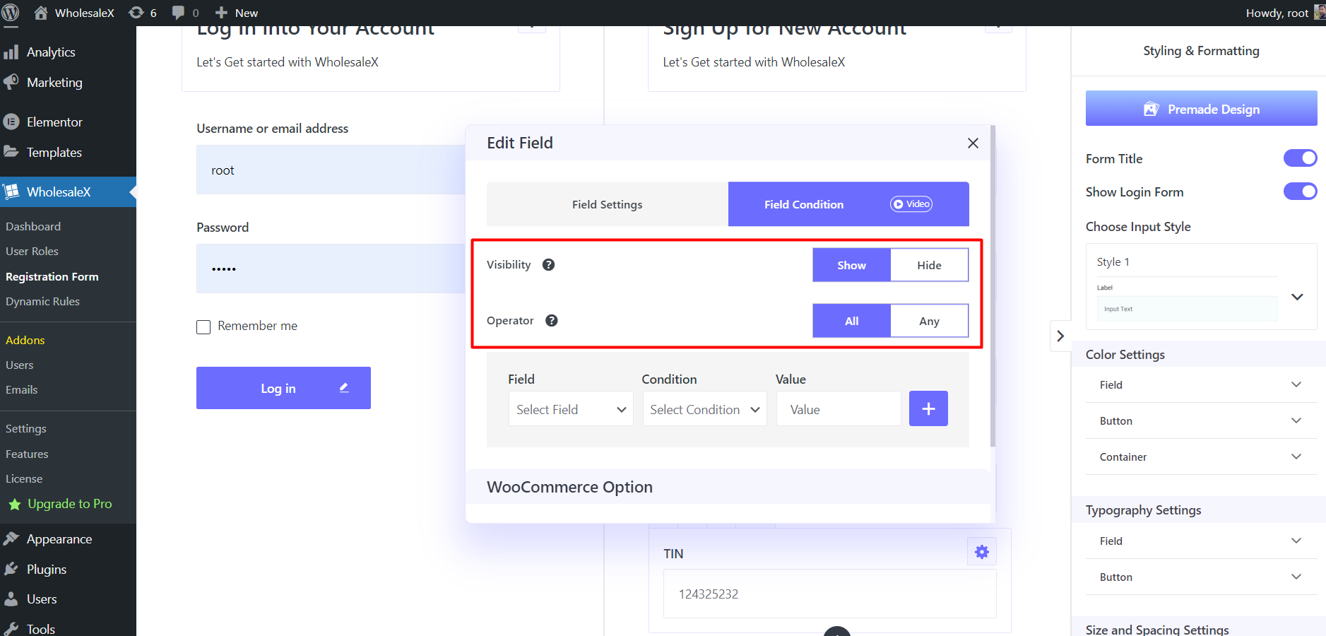
Now, we can set the conditions as per our requirements. Here you can see three options, Field, Condition, and Value. From the field option, we need to select the dependent field, from the condition option we need to select between Equal and Not Equal and add on triggering value in the value option.
So this specific field will be displayed or hidden once the value of the dependent field is equal or not equal to the value that we have added while configuring the conditional field.
Before you get confused, let me create an example conditional field. Let’s say we want to display the Tax Identification Number field once someone selects the B2B user roles.
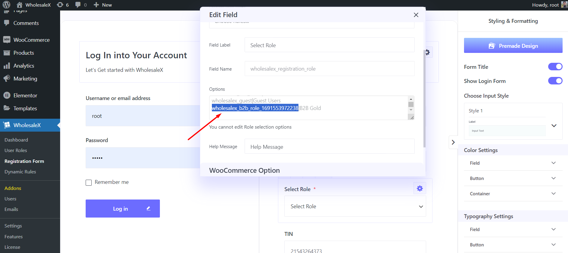
In this type of scenario, we need to select the user role field. Select Equal Condition. And add the B2B user role ID in the value section.
You can get the user ID from the Select Role field. Just click on the settings section of the field and scroll down a bit. Here you can see the Role ID along with the Role name after the separator in the Options section.
So similarly you can create conditional fields as per your requirements.
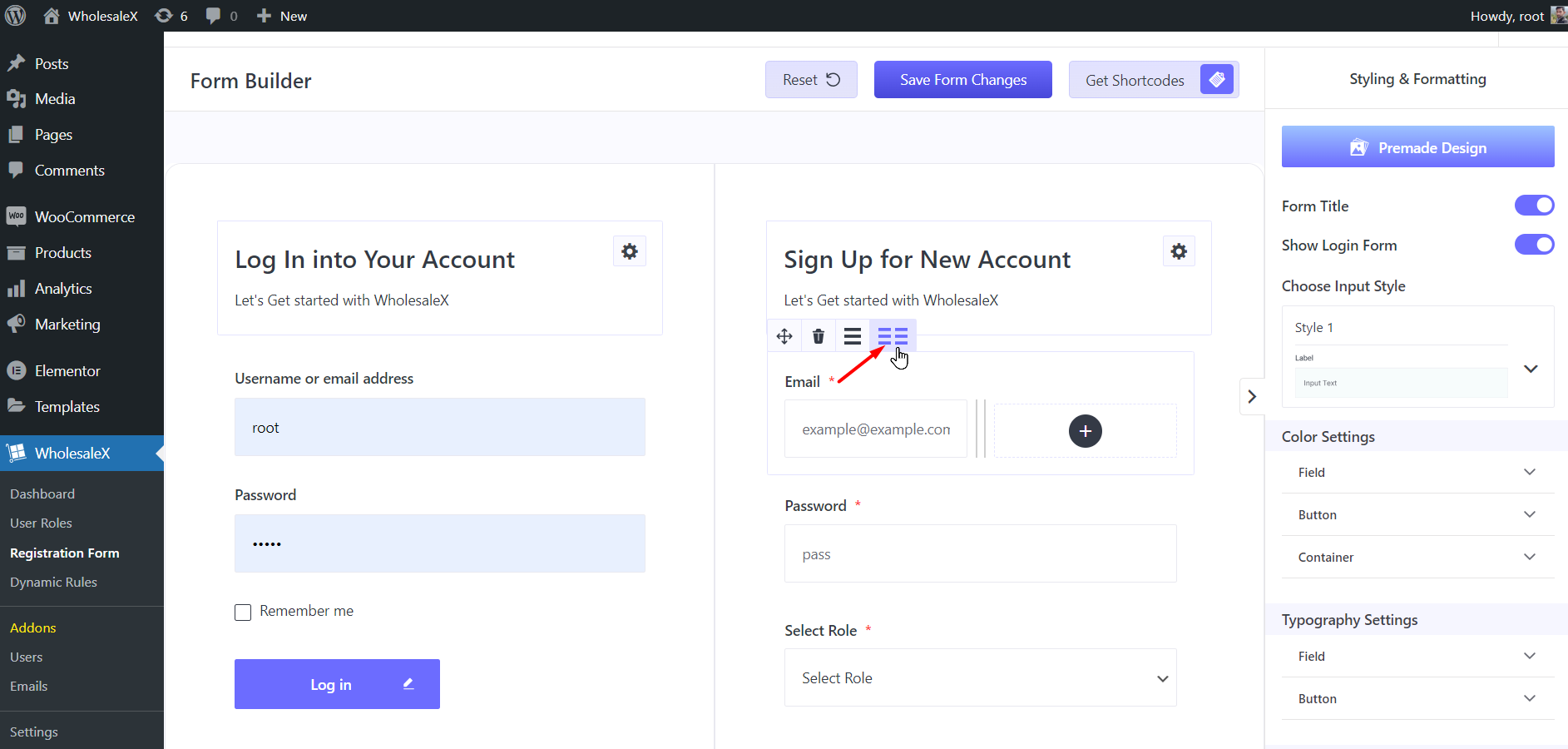
Column Option
You can use the column option if you want to display two fields side by side. Let’s say we want to add the First Name and Last name fields side by side. So we need to select the First Name field and then click on the two-column icon. Now, we can add the Last Name field by clicking on the plus icon.
Rearrange Fileds
If you are not satisfied with the arrangement of the fields, you can rearrange them effortlessly. Just click on a field and drag it to your desired position.
Styling & Formatting
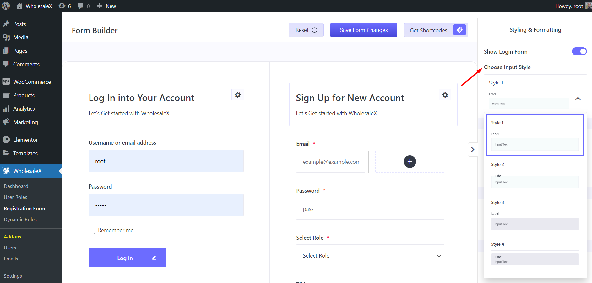
You have full customization freedom in the styling and formatting section. Starting with the premade template, you can also enable or disable the Form titles and Login Form.
Then you can choose between 8 input styles.
Moreover, you have the full customization options for:
- Colors
- Typography
- Size and Spacing
Let’s explore all of the above-mentioned settings.
Color Settings
From this section, you can select desired colors for Field, Button, and Container. Not only but you can also set different colors for Login and Registration forms.
You can open the full customization options by clicking the subitems. Once you click on two more sub-items, Login and Registration. So you can set different colors for the elements of the Login and Registration page.
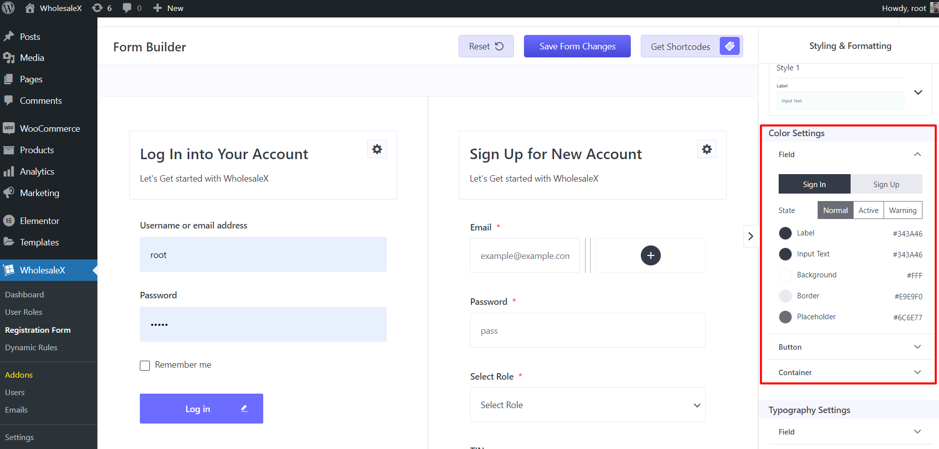
Moreover, you can add separate color-adding options for the three states. Which are
Normal: It is the default preview of the fields/elements of the registration and login forms. You are getting the following color-changing options for this state:
- Level
- Input Text
- Background
- Border
- Place Holder
Active: It refers to the preview of a field/elements while filling up the fields. So the color changes you made will be visible to the users when start filling up a field. And here are the color-changing options:
- Level
- Input Text
- Background
- Border
Warning: It refers to error detection of the field data validation. So if someone adds any wrong information it will show a warning. Here are the color-changing options for this state:
- Level
- Input Text
- Background
- Border
Similarly, you also have color-changing options for Buttons and Containers.
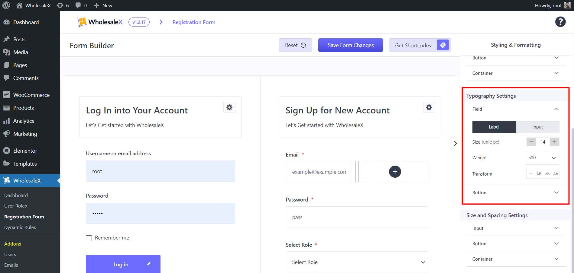
Typography Settings
From this section, you can customize the typography settings of the fields and buttons. Let’s see the available options:
Field: Here, you can change the font size, and weight and transform the text case of both Label and Input elements.
Button: For buttons also, you can change the font size, and weight and transform the text cases.
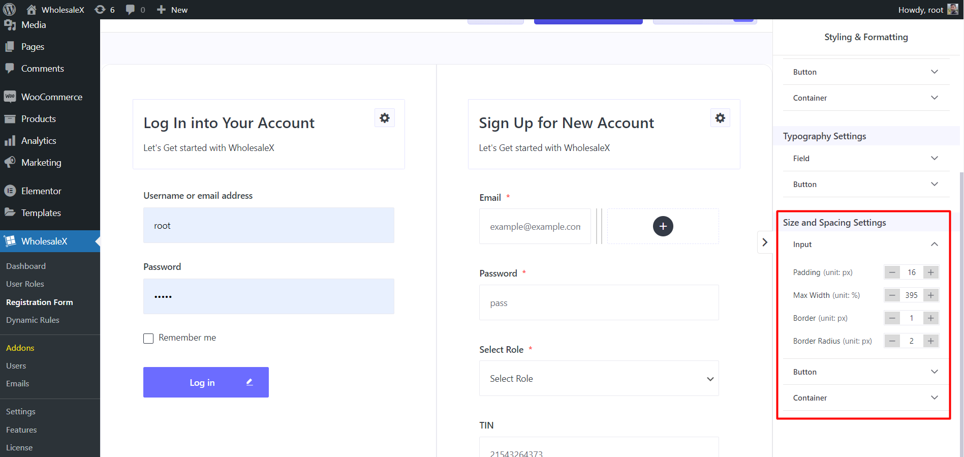
Size and Spacing Settings
Last but not least, you have the option to customize the size and spacing of the Input, Button, and Container. Here are the available options:
- Padding
- Max Width
- Border
- Border Radius
- Padding
- Separator
How to hide any field from any User Role?
You need to use the Exclude Role Items option from the Field setting to hide a field from any user role. Here’s how:
- Click on the gear icon
- Click on the Exclude Role Items field
- Choose the User roles as per your requirement
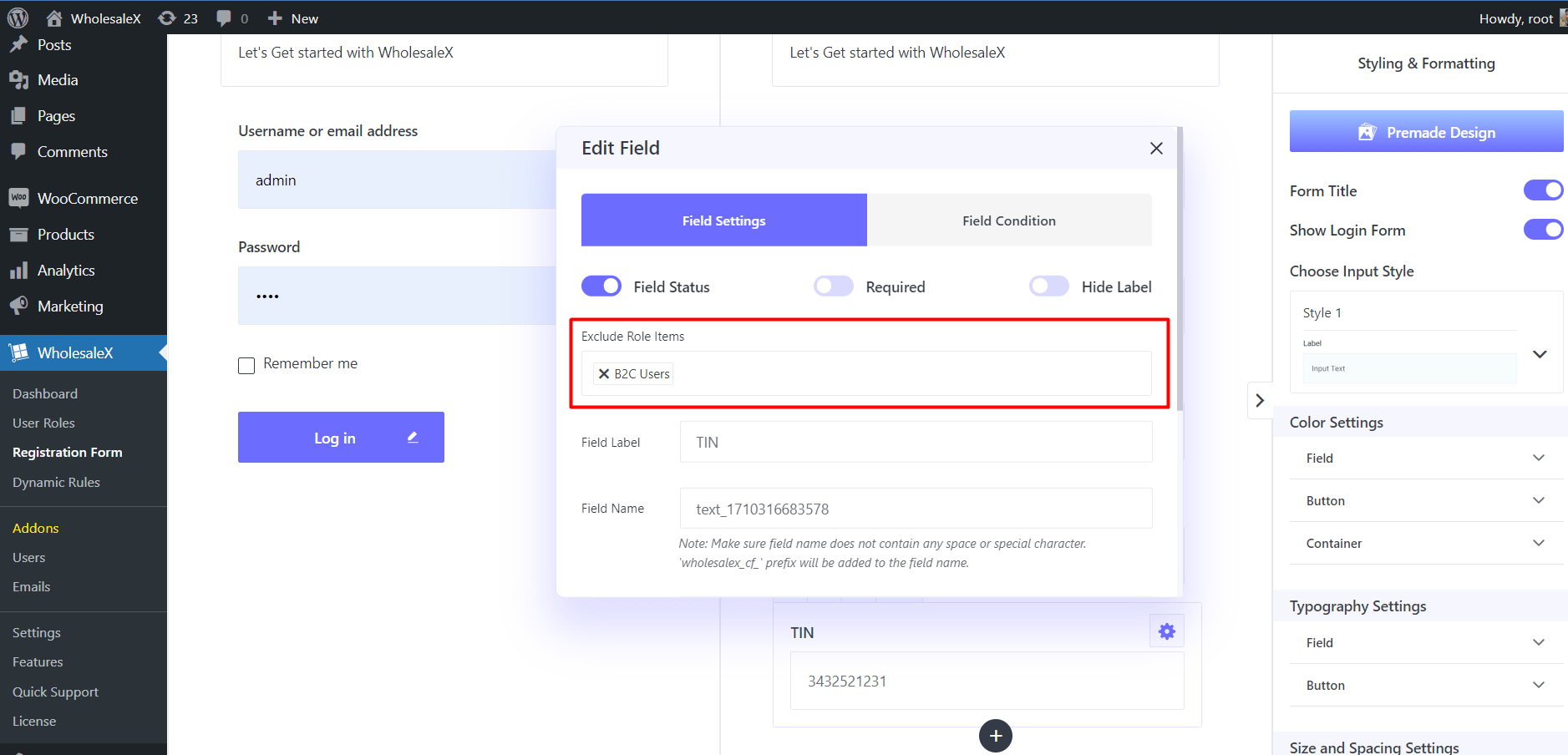
That’s all. Now the users of the selected roles will not see the field.
How to change the Field Name?
Follow the below steps to change the field name:
- Click on the gear icon ⚙️ on the top right of the field
- Field Label > Add Custom Text to rename the label.
How to change the Placeholder Text?
You can change the placeholder text of any field. Placeholders are used to indicate what users need to type in the field.
To change the placeholder text of any field Click on the gear icon ⚙️ on the top right of the field. Then add your desired text.