
The Registration Form Builder is a visual editor for configuring your store’s login and registration forms, including account behavior, messages, redirects, layout, and styling.
To access it, go to WholesaleX → Registration Form, open the builder, expand the right-side panel, and choose Form Settings or Styling.
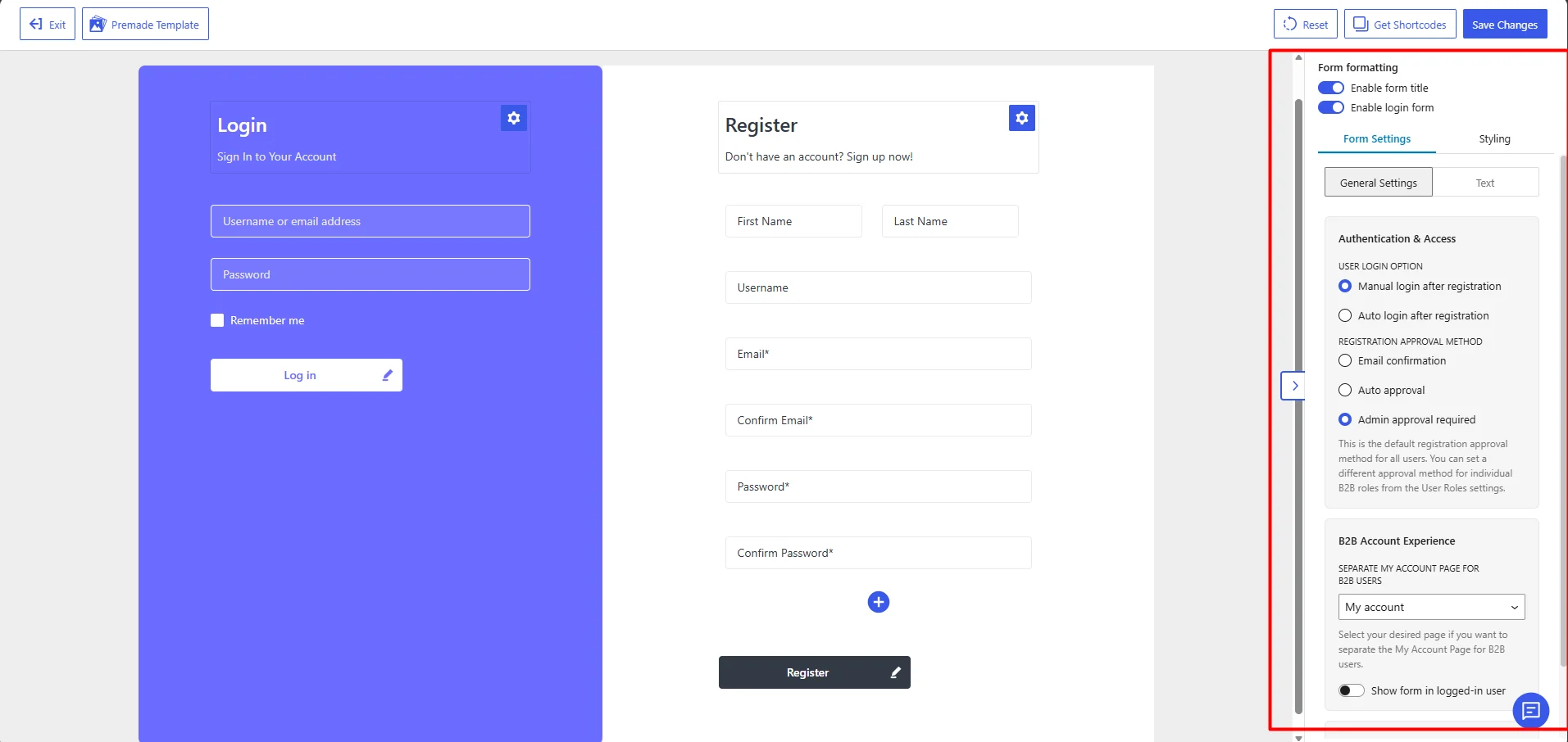
The panel has two main sections:
| 1. Form Settings (Two Tabs) a. General Settings b. Text | 2. Styling |
Control Which Form Elements Are Displayed
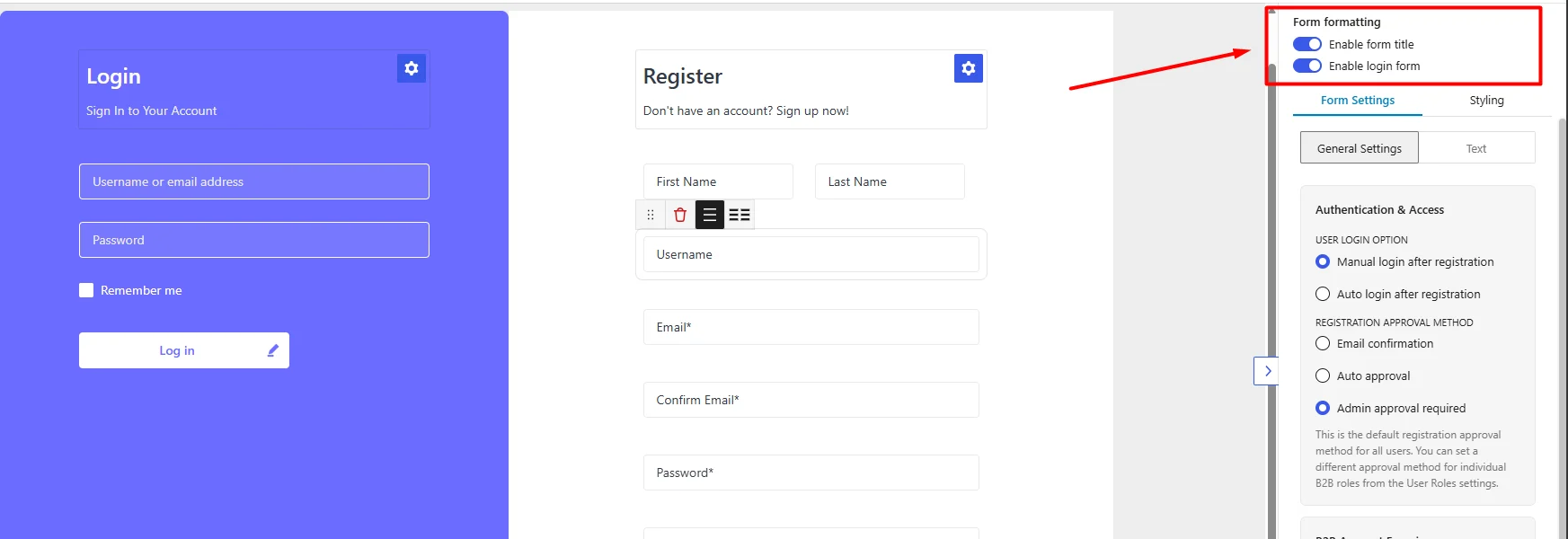
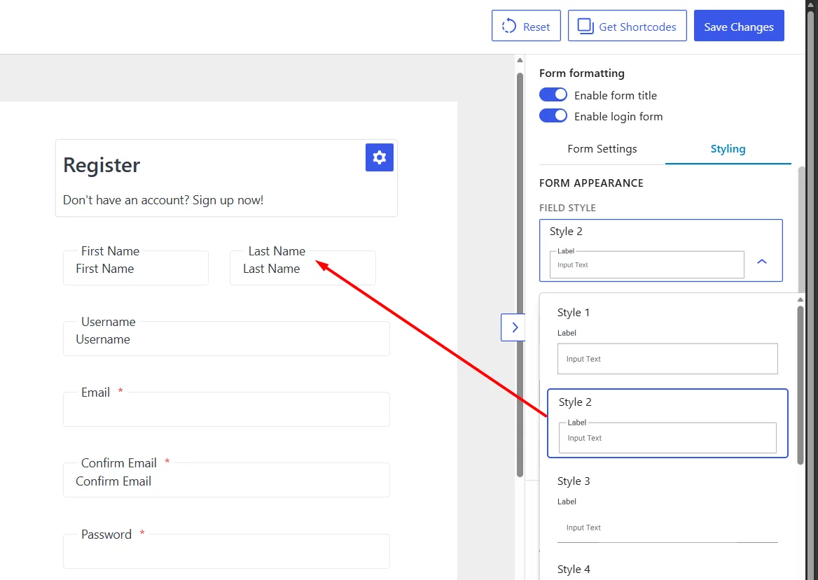
The Form Formatting options appear at the top of the panel.
Enable Form Title
Turn this option on to display the title and description above the Login and Registration forms. Turn it off to display only the form fields.
Note: The Login and Registration titles are edited separately by clicking the gear icon beside each form heading.
Enable Login Form
Turn this option on to display the Login form beside the Registration form. Turn it off when the page should display only the Registration form.
Customize the Form Title and Description
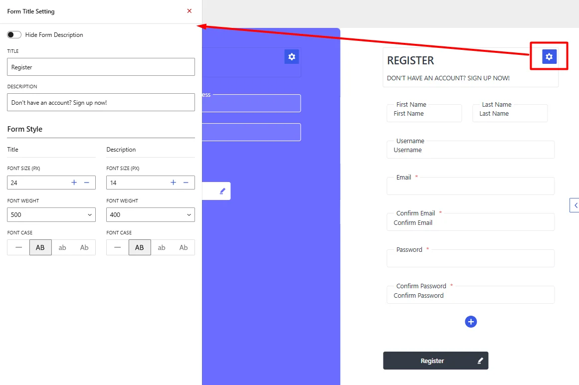
The Login and Registration forms each have separate title and description settings. To open them:
- Click the gear icon beside the Login or Registration form title.
- The Form Title Setting panel will open on the left.
- Update the content and styling for the selected form.
Changes made to the Login form do not affect the Registration form, and vice versa.
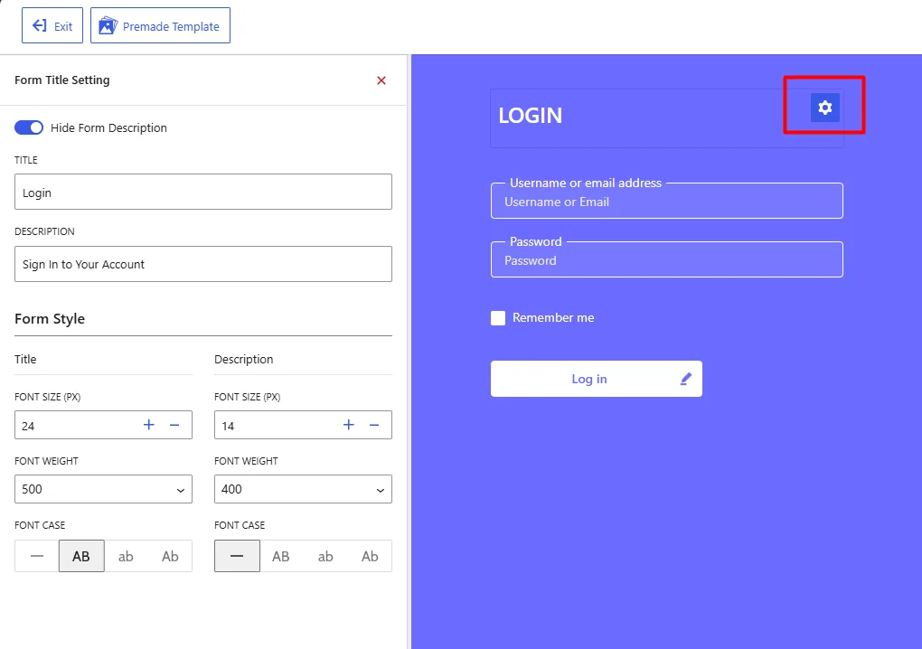
Title: Enter the main heading displayed at the top of the selected form. For examples:
LoginCustomer LoginRegisterApply for a Wholesale Account
Description: Enter the supporting text displayed below the title. For examples:
Sign in to your account.Complete the form below to apply for a wholesale account.
Hide Form Description: Enable Hide Form Description to remove the description while keeping the title visible.
Title and Description Styling
The Form Style section provides separate controls for the title and description.
| Setting | Description |
|---|---|
| Font Size | Controls the text size in pixels. |
| Font Weight | Controls how light or bold the text appears. |
| Default Case | Displays the text exactly as entered. |
| Uppercase | Displays all letters in uppercase. |
| Lowercase | Displays all letters in lowercase. |
| Capitalize | Capitalizes the first letter of each word. |
Configure Registration Behavior
Open: Form Settings → General Settings. The Authentication & Access section controls what happens after a customer submits the registration form.
User Login Option
Choose whether the customer must log in manually or is logged in automatically after registration.
Manual Login After Registration: The customer completes registration but is not signed in automatically. Use this option when:
- Accounts require administrator approval
- Customers must confirm their email first
- You want customers to sign in separately after registration
Auto Login After Registration: The customer is signed in immediately after a successful registration. Use this when accounts are approved immediately, and no additional verification is required.
Note: Auto login is usually not suitable when Admin Approval Required or Email Confirmation is selected.
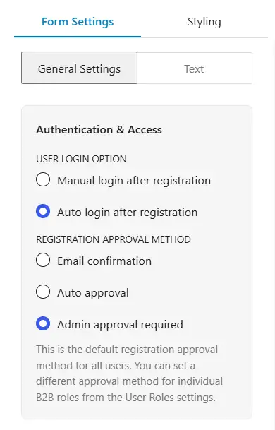
Registration Approval Method
Choose how new customer accounts are approved.
Email Confirmation: The customer must confirm the submitted email address before the account becomes available. Use this when email ownership must be verified.
Auto Approval: The account is approved immediately after registration. Use this when any valid registration can access the account without review.
Admin Approval Required: The account remains pending until an administrator reviews and approves it. Use this for wholesale applications that require:
- Business verification
- Eligibility checks
This setting acts as the default approval method. A different approval method can be assigned to an individual B2B role from the WholesaleX User Roles settings.
Configure the B2B Account Experience
The B2B Account Experience section controls the account page and form visibility for logged-in customers.
Allow Separate “My Account Page” for B2B Users
Select a page from the dropdown when B2B customers should use a different WooCommerce My Account page. Use a separate page when wholesale customers need a dedicated:
- Account dashboard
- Ordering interface
- B2B account experience
Keep the default My Account page selected when B2B and B2C customers should use the same account page.
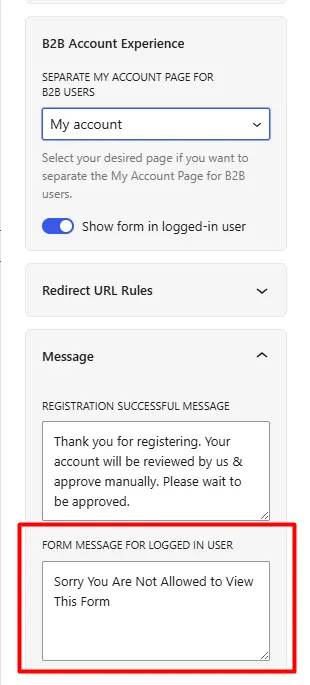
Show Form in Logged-In User
Turn this option on to keep the Login and Registration forms visible to users who are already logged in. Turn it off when they should see a message instead of the forms.
Note: The message shown in that situation can be edited under Message → Form Message for Logged In User.
Customize Form Messages
Open the Message section under General Settings.
Registration Successful Message: Enter the message shown after the registration form is submitted successfully. Avoid using a general success message that tells customers their account is ready when it still requires confirmation or approval.
Note: The message should match the selected approval method. Some examples are given below:
For admin approval
Thank you for registering. Your application will be reviewed, and we will notify you after approval.
For email confirmation
Thank you for registering. Check your email and confirm your address to complete the registration.
For automatic approval
Your account has been created successfully. You can now access your account.
Set Redirect URLs
Open the Redirect URL Rules section under General Settings. Redirects determine which page customers visit after registration or login.
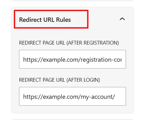
Redirect Page URL After Registration
Enter the full URL of the page customers should visit after submitting the registration form. Example:
https://example.com/registration-complete/
Choose a destination that matches your approval method. For example, customers awaiting administrator approval should be sent to a page explaining that their application is under review.
Redirect Page URL After Login
Enter the full URL of the page customers should visit after signing in. Example:
https://example.com/my-account/
Leave the fields empty to use the default login and post-registration destination.
Customize Supporting Text
Open: Form Settings → Text. This section controls text shown in specific access-related situations.
Logout to See This Form Text: Enter the message shown when a logged-in user must log out before accessing the form.
Login to See Price Text: Enter the message shown when product prices are hidden from logged-out visitors.
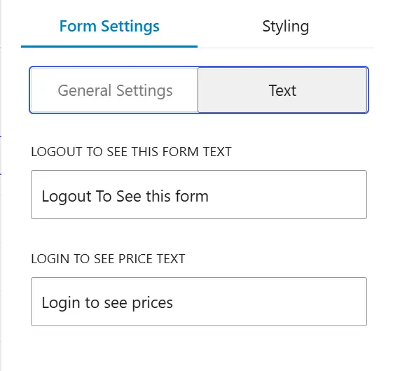
Style the Login and Registration Forms
Open the Styling tab to control the appearance of both forms. The main options include:
- Field style and Field size
- Button size and Button width
- Field and button shape
- Container padding and corner radius
- Color theme
Choose a Field Style
Open the Field Style dropdown and select one of the available design presets. Each preset changes how labels and input fields appear.
Set the Field Size
Choose one of the following:
| Size | Best suited for |
|---|---|
| Small | Compact forms |
| Medium | Standard layouts |
| Large | Prominent or touch-friendly forms |
Configure Button Size and Width
Button Size: Choose from Small, Medium, or Large. This changes the height and overall size of the Login and Register buttons.
Button Width: Choose how much horizontal space the buttons use between Fixed and Full.
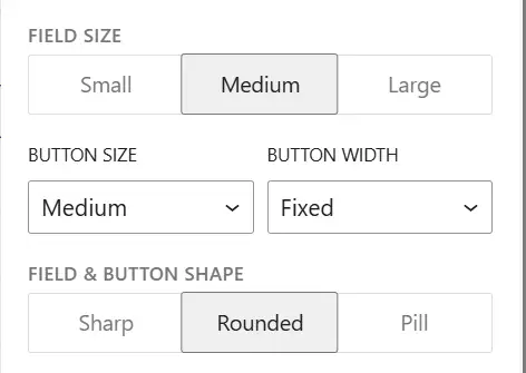
Use Full when you want a more prominent button or a layout that works well on narrow screens.
Choose the Field and Button Shape
The Field & Button Shape setting applies one corner style to inputs and buttons. Choose among Sharp, Rounded, or Pill.
Adjust the Form Container
Padding: Padding controls the space between the form content and the outer edge of the form container. Increase the value when the content feels crowded against the edges. Reduce it when you need a more compact design.
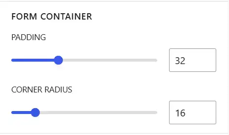
Corner Radius: Corner Radius controls the roundness of the outer form container. This setting affects the form container, not the individual input fields.
- Lower value: sharper corners
- Higher value: more rounded corners
Apply a Color Theme
The Color Theme section provides predefined color palettes. Select a theme to apply its colors to the form. Click Customize to edit each color separately.
Customize Signup and Login Colors Separately
The Theme Customization area contains two tabs: Signup and Login.
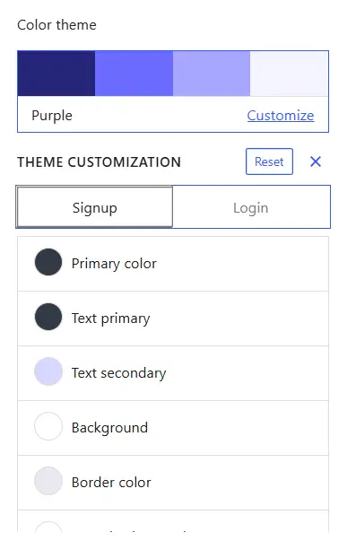
Available Color Controls
| Field Name | Definition |
|---|---|
| Primary Color | Controls the main accent color used for prominent form elements. |
| Text Primary | Controls the main text color, including headings and labels. |
| Text Secondary | Controls supporting text and descriptions. |
| Background | Controls the main background color of the selected Login or Registration form. |
| Border Color | Controls field borders and other outlined elements. |
| Input Background | Controls the background color inside the form input fields. |
| Button Text | Controls the text color inside the Login or Register button. |
| Link | Controls the color of links and other clickable text. |
| Container Color | Controls the color of the surrounding form container. |
When selecting colors, make sure:
- Text remains readable against its background
- Input boundaries remain visible
- Button text contrasts with the button background
- Links can be distinguished from regular text
Reset the Theme: Click Reset to restore the selected theme’s default colors. Use the X icon to close the Theme Customization area.
Save and Verify the Settings
Click Save Changes after completing the configuration. Test the form from the frontend in the following situations:
- Logged out
- Logged in
- After submitting a registration
- After logging in
- On desktop
- On mobile